how to do a donut with percentage inside?
Posted: Tue Feb 18, 2014 10:30 pm
Hi,
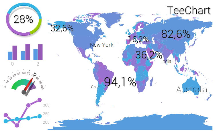
I have seen a couple of screens you've published, and noticed a dashboard with a donut with percentage in the middle.
http://www.steema.com/uploads/gallery/D ... eChart.png
How to do this with xe5 teechart pro last version?
Also I don't find how to make these percentages with different sizes with the map series.
Same question about flat design shown in
http://steema.com/entry/186/New_flat_de ... _products_
Thanks
Gonzalo